Content Design Lead CPD Accredited Plain Numbers Practitioner Direct Line • Churchill • Privilege Regulated Financial UX & Strategy

Designing clear, high-performing insurance experiences around real customer intent.

I lead end-to-end content design across multi-brand digital products, self-service ecosystems, and regulated policy communications—combining UX partnership, iterative user research, and behavioural science to improve customer comprehension and commercial outcomes.

Account Sign-In (OTP Launch)
+43% Successful Sign-Ins
Replaced password dependency with One-Time Passcodes, cutting password failures by 61%.
Account Landing Page Exits
Exit Rate Reduced to 1.5%
Redesigned post-login navigation, dropping early exits from 12% on Churchill & 9% on Direct Line.
Help Page Call Deflection
28% → 11% Phone Numbers Seen
17pp drop in visitors reaching a phone number by routing tasks to self-service & Virtual Assistant first.
Home Essentials Launch
+1pp Sale Conversion
Redesigned 3-tier comparison page, lifting click-through by +8pp and user comprehension to 90%.
Churchill Policy Booklet
"Fair" → "Good" Jargon Score
Led 250+ wording edits with Legal & Underwriting and resolved 100% (29/29) of over-length sentences.

Selected Portfolio Case Studies

Six flagship programmes spanning brand systems, product launches, authentication UX, call deflection, and regulated communications.

Project 01 • Brand & Design Systems

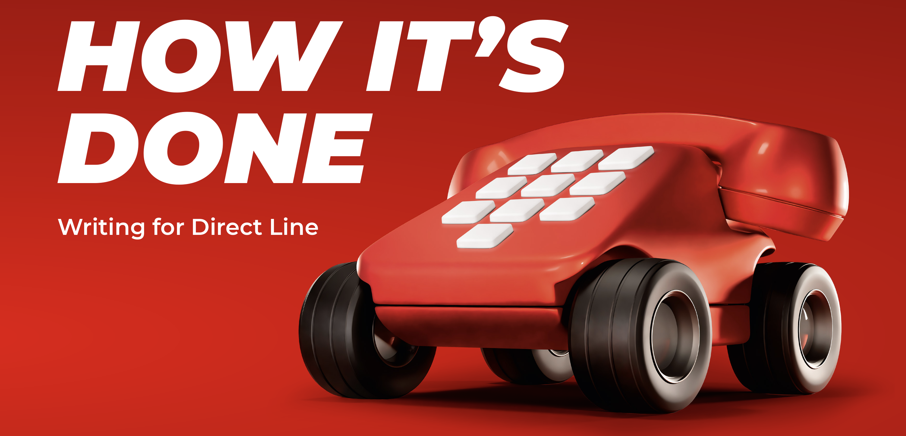
Direct Line Tone of Voice ("How It's Done")

Overhauling a bloated 29-page brand deck into a sharp 16-page operational playbook with emotional flexing rules and a 1-page Cheat Sheet.

Project 02 • Product Launch & Research

Launching Home Essentials

Leading a new lower-cost insurance tier from concept to launch—making reduced cover limits and excesses transparent across 2,400+ tested users.

Project 03 • Authentication & Self-Service

Transforming Sign-In & Customer Account

Replacing password friction with One-Time Passcodes (+43% sign-ins) and redesigning post-login IA around concrete customer tasks.

Project 04 • IA & Call Deflection

Redesigning Help Around Customer Intent

Shifting three brands from phone-heavy "Contact Us" pages to progressive, task-led "Help & Support" journeys that protect vulnerable users.

Project 05 • Behavioural Design

Plain Numbers Welcome Letter Redesign

Turning a cluttered, number-heavy 2-page Welcome Pack into a 1-page narrative confirmation adopted by Plain Numbers as an industry benchmark.

Project 06 • Regulatory Content Design

Churchill Home Policy Booklet Rewrite

Leading cross-functional Legal and Underwriting sessions to deliver 250+ edits, eliminate all 29 over-length sentences, and contextualise legal terms.

Direct Line Role: Content Lead Brand Strategy & Governance Design Systems

1. Redefining the Direct Line Tone of Voice ("How It's Done")

Maturing Direct Line's brand voice documentation from a 29-page agency-style deck into a practical, comprehension-first 16-page playbook designed for product squads, copywriters, and sign-off stakeholders.

Document Length Reduction
29 → 16 Pages (-45%) Removed agency filler and MS Word tips to create a concise playbook
Brand Voice Framework
5 Behavioural Pillars Summarised on a 1-page Cheat Sheet with Do/Don't guardrails
Governance Architecture
2-Tier Standards Model Separated Brand Voice from Technical Content Guidelines
High-Stakes Journeys
Emotional Tone Flexing Dedicated rules for claims, complaints, and renewal price increases

The Challenge with the Legacy Guide

Following Direct Line's shift from "We're on it / Just what's needed" (2025) to the new "That's how it's done" brand platform (2026), the existing 29-page Tone of Voice guide was no longer fit for digital product or servicing teams:

  • Confused Voice with Mechanics: Mixed high-level brand attitude with step-by-step instructions on how to open the spellchecker in Microsoft Word and dismissive grammar advice ("Don't tie yourself up in knots over grammar... invite them to go away and check").
  • Risky Stylistic Prompts: A dedicated page urged writers to "Use poetic effects" like alliteration and "words with zip"—risking clever wordplay over comprehension in regulated insurance journeys.
  • No High-Stakes Emotional Guardrails: Lacked actionable rules for handling stressed or upset customers during claims, complaints, or renewal price increases.

Strategic Overhaul & Governance

I redesigned the guide from the ground up into "How It's Done: Writing for Direct Line":

  • Architectural Separation: Drew a hard line on Page 2 between Voice (personality and attitude) and Content Guidelines (grammar, accessibility, SEO, glossary terms, and formatting conventions).
  • Dual Audience Alignment: Built explicitly for both writers (web, print, email, letters, scripts, product journeys, support) and reviewers/approvers needing a shared standard for "what good looks like".
  • Comprehension First Rule: Anchored the 1-page Cheat Sheet in a single governing principle: "If the customer can't understand it quickly, nothing else matters. Start with clarity, then add Direct Line personality."
2026 Pillar Legacy 2025 Approach ("Just What's Needed") New 2026 Approach ("How It's Done")
1. We speak with warmth Before Vague advice to "Be positive... We're not all doom and gloom." After Everyday human words, contractions, and you/we/our. Friendly, never chatty, salesy, or cheesy.
2. We're transparent Before Generic warning to "Watch out for weasel words like may, aim and could." After Straight to the point, no "sneaky" small print. Direct and upfront even on bad news like price increases; owning mistakes clearly.
3. We make life easier Before MS Word Flesch Reading Ease instructions and generic white-space tips. After Structural content design: breaking complex topics into what you need / what we'll do / what happens next with active ownership.
4. There's energy in everything we do Before Urged writers to use alliteration and "words with zip". After Pace, rhythm, and lively verbs when they aid clarity—paired with a strict guardrail: "Don't prioritise 'fun' over understanding."
5. We turn up in the moments that matter Before No dedicated crisis/claims pillar; loosely grouped under "Can do". After Calm, reassuring, practical, and decisive when stakes are high (claims, complaints, bad news), without confusing caveats.
Tagline & Editorial Guardrails Before Only covered basic FAQs, T&Cs, and a Facebook reply. After Added strict proof-point rules for "That's how it's done" (e.g., 5-year repair guarantee), Magazine article rewrites (removing "blind summits"), and App UI banner comparisons ("Fill up for less with our app").
Visual Evidence: New 2026 Direct Line Tone of Voice Playbook ("How It's Done") Primary Work Showcase + Full Playbook PDF
How It's Done - Writing for Direct Line (2026 Tone of Voice Guide)
New 2026 Direct Line Tone of Voice Guide: "How It's Done: Writing for Direct Line" Redesigned 16-page operational playbook created for product writers, customer service teams, agencies, and sign-off stakeholders.
Inside the Playbook: 1-Page Tone of Voice Cheat Sheet New 16-Page Guide
1. We speak with warmth Everyday language. Human words. Friendly but not cheesy.
2. We're transparent Straight to the point. No jargon. No "sneaky" small print.
3. We make life easier Make the next step easy to understand. Clear steps & ownership.
4. Energy in everything Pace and punch when it helps understanding.
5. Moments that matter Calm, reassuring and decisive when stakes are high (claims & bad news).
Governing Principle: "If the customer can't understand it quickly, nothing else matters. Start with clarity, then add Direct Line personality."
How It's Done: Writing for Direct Line (2026) Complete 16-page Tone of Voice guide with Cheat Sheet, Do/Don't guardrails & channel examples
Legacy Baseline (Before)
2025 "Just What's Needed" Deck

The previous 29-page guide that mixed brand personality with basic MS Word spellcheck instructions, risky "poetic effects" prompts, and generic readability traits.

📄 View Legacy 2025 PDF (Before)


Direct Line & Churchill Role: Content Design Lead Product Positioning & Go-to-Market User Research (2,400+ Customers)

2. Designing & Launching Home Essentials Across Two Brands

Leading the end-to-end digital customer experience for a new lower-cost Home insurance tier—turning a complex trade-off (lower price in return for reduced cover limits and higher excesses) into a transparent, high-converting three-tier comparison journey.

Quote-to-Sale Conversion
+1pp Conversion Uplift Increased sales conversion on the redesigned 3-tier premium page
Premium Page Engagement
+8pp Click-Through Rate Higher user progression backed by stronger heatmap engagement
Excess & Add-On Clarity
84% & 94% Comprehension Excess clarity rose from 77% to 84%; Optional Extras from 81% to 94%
Product Trade-Off Clarity
90% Limits / 86% Proposition 90% understood reduced cover limits; 86% grasped overall tier proposition

The Proposition & Regulatory Challenge

Home Essentials was created for price-conscious buyers, offering a lower price in exchange for reduced cover, lower limits, higher excesses, fewer standard features, and an online-first service.

As Content Design Lead across Product, UX, Underwriting, Compliance, Financial Promotions, and Marketing, I structured the journey around six fundamental customer questions:

  • What is the difference between the three product tiers?
  • Why does Home Essentials cost less, and what is/isn't included?
  • How much will I actually pay out-of-pocket if I make a claim?
  • Which features need to be added separately as optional extras?

Research-Led Content Interventions

  • Progressive Tier Comparison: Replaced decorative ticks with neutral bullets and made features build incrementally across the three tiers so trade-offs were unmistakable.
  • Removing Misleading Microcopy: Changed "Included at no extra cost" (which implied higher-tier features were free) to "Included if you choose Home Insurance Plus".
  • Retiring "Premium" Jargon: Research showed users confused "premium" with a higher-quality product tier. Replaced it with "What you pay".
  • Scenario-Tested Excess Tables: Tested whether customers could calculate what they'd pay for realistic claims (escape of water, subsidence, theft). Added dividing lines, improved mobile layout, and stripped out copy bloat.
  • Explicit Optionality: Used the clear label "Optional" where price noise risked making add-ons appear automatically included, and resolved cross-system naming inconsistencies before launch.
Visual Evidence: Three-Tier Comparison & Progressive Disclosure Click image to open at 50% page width
Direct Line, Churchill & Privilege Role: Content Design Lead Authentication UX & IA Digital Adoption

3. Transforming Sign-In and Self-Service Across Customer Account

A multi-month partnership with UX, Product, Analytics, and Engineering to remove password barriers via One-Time Passcodes (OTP) and restructure the logged-in account space around recognisable customer tasks.

OTP Authentication Launch
+43% Successful Sign-Ins Drove 43% more sign-ins and +13% more new account activations
Password Friction Reduction
-61% Password Failures Cut incorrect-password errors by 61% and password resets by 56%
Sign-In Support Demand
0 Sign-In Support Calls Zero customers required assisted sign-in support in launch reporting
Account Landing Page Exits
12% → 1.5% Exit Rate Early exits fell to 1.5% on both Churchill (from 12%) & DL (from 9%)

Part 1: Fixing Sign-In, Activation & Error States

  • One-Time Passcode (OTP) Flow: Replaced password dependency with a succinct 3-step email OTP journey, removing competing instructions during a high-pressure moment.
  • Designing Around Success Over Preference: Used live variant data (showing 1,353 password attempts produced only 996 successful logins) to successfully argue against giving passwords equal visual prominence with OTP.
  • Instant Activation Recovery: Unactivated accounts automatically received a fresh setup email rather than dead-ending in password resets.
  • Humanising Backend Errors: Replaced system messages exposing "authentication IDs" and "account matching failures" with service-owned, blame-free guidance.
  • Improving Usability Testing (SUS): Rewrote academic System Usability Scale survey prompts (removing words like "cumbersome") into plain task language ("I found the website complicated to use").

Part 2: Redesigning the Post-Sign-In Account

  • Replacing "Make a Change" Jargon: Virtual Assistant data showed "How do I make a change?" drove 59,034 queries (10.21% of servicing volume). Replaced generic labels with concrete tasks: "Add a driver", "Change your registration", and "Change your excess".
  • Click-Testing Cancellation Placement: Overturned the internal assumption that users look under Policy Details to cancel. Click-testing proved 74% selected Make a change vs. 2% for Policy Details, so we placed cancellation inside policy changes.
  • Scannable Documents Area: Stripped repetitive brand names from document labels, improved versioning logic so users always found their latest certificate, and helped drive a ~20% reduction in in-account Virtual Assistant queries and 36%–100% uplifts in renewal click-through.
Visual Evidence: Redesigned Customer Account Documents Area Click image to open at 50% page width
Direct Line, Churchill & Privilege Role: Content Design Lead Information Architecture Self-Service & Call Deflection

4. Redesigning Help Around Customer Intent Across Three Brands

A multi-month Content Design and UX partnership that transformed phone-led "Contact Us" pages into a scalable, progressive "Help and Support" ecosystem across Churchill, Direct Line, and Privilege.

Phone Number Exposure
28% → 11% 17pp reduction in Help visitors progressing as far as seeing a phone number
Help-to-Account Conversion
+5% Further Sign-In Uplift Additional 5% rise in Help-to-sign-in rates after initial launch surge
Digital Assistant Adoption
#1 Contact Method CTR Virtual Assistant achieved highest click-through of all support options
Cross-Brand Scalability
3 Brands & Claims Hubs Reusable task framework rolled out across Churchill, Direct Line & Privilege

From "Contact Us" to Progressive Support

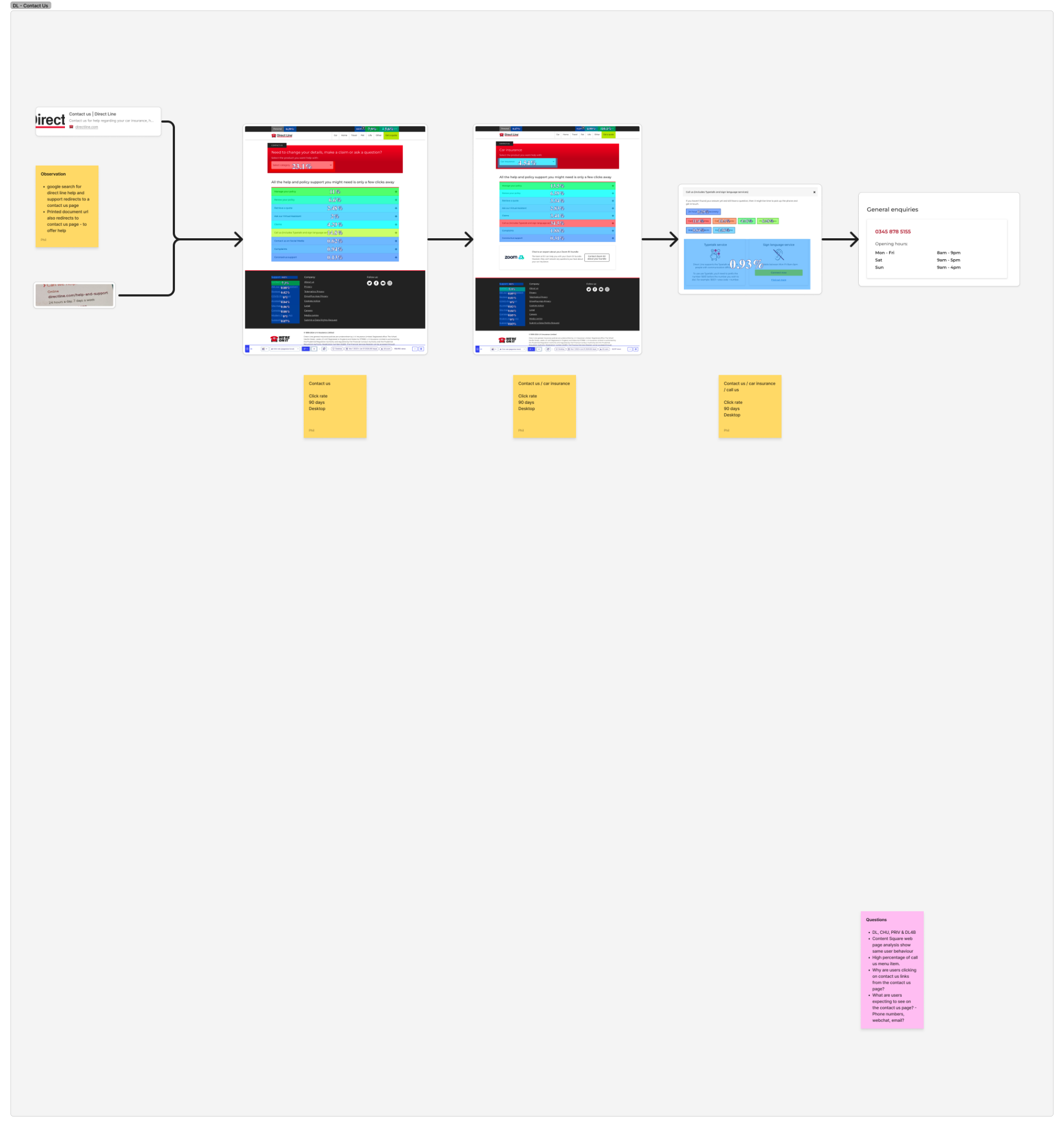
Legacy "Contact Us" pages were organised around internal business channels and phone numbers, priming customers to call even when they could self-serve faster online.

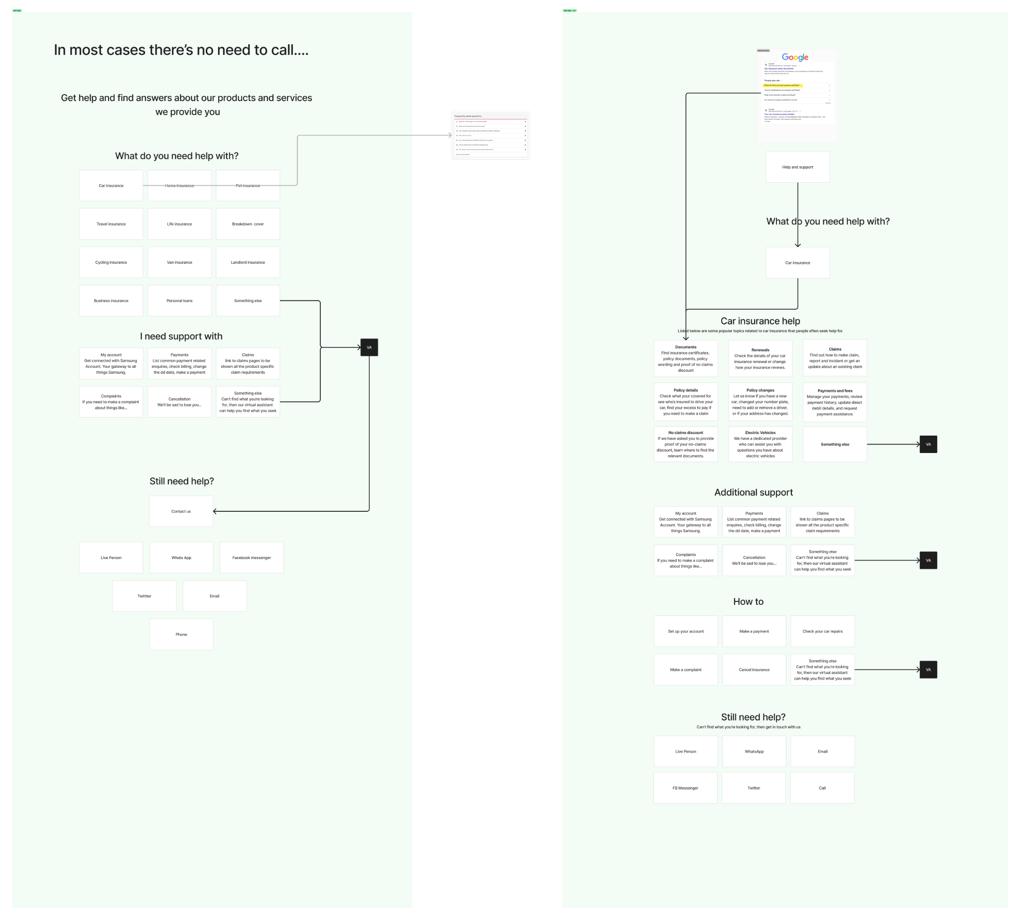
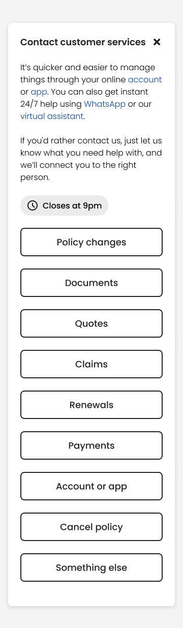
  • Reframing the Core Question: Shifted from "How do you want to contact us?" to "What do you need help with?"—organising the architecture around customer intent (claims, policy changes, documents, renewals).
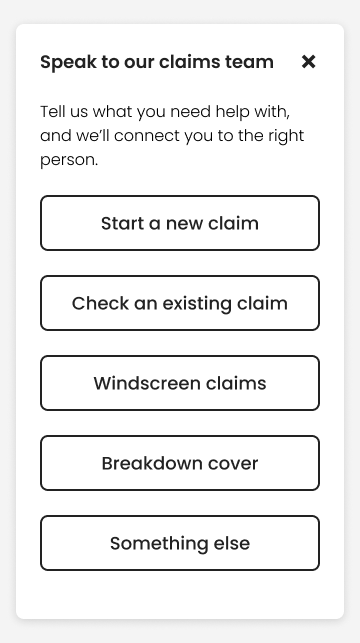
  • 4-Stage Progressive Hierarchy: (1) Identify customer task → (2) Route directly to self-service (App, Online Account, Motor Claims Hub) → (3) Offer digital assistance (Virtual Assistant, WhatsApp) → (4) Provide targeted telephone support.
  • Outcome-Led CTAs & Value Copy: Replaced vague links like "Manage online" with concrete actions ("Make or track a car claim", "Update your policy", "Find and download your documents") and explained the benefit (no phone queues, instant documents).

Omnichannel Alignment, Vulnerability & SEO

  • Fixing WhatsApp & Phone IVR: Resolved desktop QR-code journeys that dropped users into blank WhatsApp chats without context, and aligned web copy with phone IVR scripts to eliminate conflicting admin fee claims.
  • Supporting Vulnerable Customers: Co-designed discoverable additional-support journeys with neurodiversity and vulnerability specialists—creating dedicated hubs for Insurance for Everyone, Money Worries, and Difficult Times.
  • Protecting Search Visibility & Intent Tracking: Partnered with SEO pre-launch to retain organic visibility for "contact/claims number" searches, while capturing diagnostic intent data proving policy changes and general enquiries were the top remaining call drivers.
Visual Evidence: Discovery, Wireframes, Final Hubs & Vulnerable Customer Support (10 Screens) Click any screen to open at 50% page width
Churchill Home Insurance Role: Content Lead & Accredited Plain Numbers Practitioner Behavioural Design & Numeracy Consumer Duty

5. Redesigning the Churchill Welcome Pack Using the Plain Numbers Approach

Applying accredited Plain Numbers behavioural principles to transform a cluttered, number-heavy two-page Welcome Pack into a clear, single-page narrative confirmation—selected by the Plain Numbers team as a flagship industry example.

Professional Accreditation
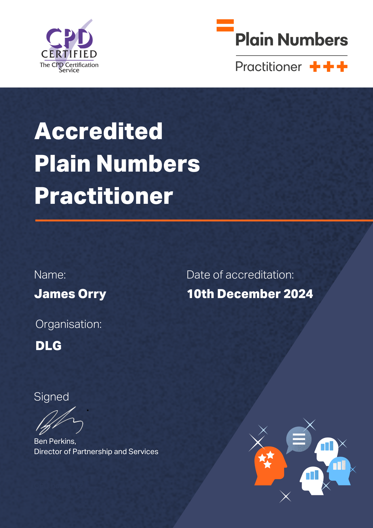
CPD Certified Practitioner Accredited Plain Numbers Practitioner (Dec 2024)
Document Consolidation
2 Pages → 1 Narrative Page Replaced fragmented tables and sidebars with a 1-page confirmation
Number Clutter Reduction
4x → 1x Price Display Removed 3 duplicate £555.93 tables, IPT jargon & 10+ phone digits
External Recognition
Plain Numbers Exemplar Adopted by the Plain Numbers team as an industry benchmark

The Numeracy & Comprehension Problem

Half of UK working-age adults have primary-school numeracy levels. Independent Kantar trials showed that while 60–72% of customers believed they understood financial documents, actual comprehension was as low as 13–35%.

  • 20+ Competing Numbers on Page 1: Phone numbers, 7-day call-centre hours, unspaced 10-digit policy numbers, page references, and currency competed for attention.
  • Looks Like an Unpaid Bill: Repeating £555.93 four times across pseudo-invoice tables ("Your premium" vs. "Your payment") created anxiety over whether action was needed.
  • Channel Conflict: Placing phone numbers and opening hours in the top-left reading zone actively encouraged avoidable support calls.

The Plain Numbers Solution

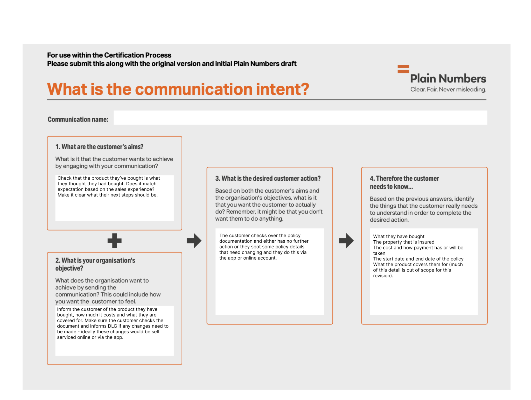
Using the Communication Intent Framework and the three Plain Numbers Principles (Numbers Themselves, Numbers in Context, and How We Think to support System 2 slow thinking), I redesigned the pack:

  • Stripped Distracting Digits & Chunked IDs: Removed phone numbers and opening hours in favour of Churchill.com/help, and chunked the policy number into 8050 899 213.
  • Narrative Duration & Payment Reassurance: Replaced four tables and IPT jargon with: "Your Churchill Plus home insurance will start on 24 July 2024 and end on 23 July 2025. You've already paid the total cost of £555.93."
  • Fee-Free Self-Service Nudge: Replaced 7 sub-bullets of dense warnings with a clear prompt to make changes "with no admin fee by using the Churchill app or by signing in to your online account."

Legacy 2-Page Welcome Pack Before (2 Pages, 20+ Numbers)

Cluttered sidebar with phone numbers & opening hours, unspaced policy ID, missing end date, and £555.93 repeated 4 times across pseudo-invoice boxes.

Left Sidebar: Need to claim? 0345 878 6414 | Call 0345 878 6414 Mon to Fri 8am to 8pm, Sat 9am to 5pm, Sun 9am to 4pm | Policy number 8050899213

At a glance box (Page 1): Annual premium £555.93 (> See page 2) | Start date: 24 July 2024 [No end date shown]

Page 2 Table ("Your premium"): Churchill Plus cover: £555.93 → Annual premium including Insurance Premium Tax: £555.93

Page 2 ("Your payment"): We received £555.93 from card ending 4343 on 14 August 2024.

Plain Numbers 1-Page Confirmation After (1 Page, Narrative Flow)

Single-page narrative hierarchy with chunked policy number, explicit start and end dates, single price confirmation, and fee-free app/account CTA.

Top Right Header: Policy Number 8050 899 213 | Get help whenever you need us: Churchill.com/help

Hi Peter, your home at 64 Zoo Lane is covered

Your Churchill Plus home insurance will start on 24 July 2024 and end on 23 July 2025. You've already paid the total cost of £555.93.

It's important you check your policy documents carefully: You must let us know if anything is incorrect, missing or has changed...

You can make changes yourself with no admin fee by using the Churchill app or by signing in to your online account.

Visual Evidence: Practitioner Accreditation & Communication Intent Framework Click image to open at 50% page width
Churchill Home Insurance Role: Content Design Lead Regulatory Content Design Cross-Functional Governance

6. Rewriting Churchill's Home Policy Booklet for Fairer Finance's Clear & Simple Mark

Leading Content, Legal, Underwriting, Product, and CX through 250+ targeted policy wording edits—improving readability and customer comprehension without weakening contractual precision or underwriting scope.

Fairer Finance Jargon Rating
Upgraded "Fair" → "Good" Improved independent readability & jargon score across the policy booklet
Sentence Length Compliance
29 / 29 Long Sentences Fixed Rewrote 100% of sentences that exceeded the 29-word readability cap
Cross-Functional Governance
250+ Policy Wording Edits Signed off collaboratively across Legal, Underwriting & Product
Protected Legal Terminology
In-Section Plain Primers Secured Fairer Finance agreement to discount explained legal terms

Scale of the Problem & Collaborative Leadership

Fairer Finance's baseline assessment gave the booklet a "Fair" jargon score, flagging 29 sentences over the 29-word cap and heavy repetition of complex terms: "liability" (38x), "representative" (30x), "possessions" (26x), "premium" (22x), and "sum" (19x).

Rather than passing Word drafts between siloed teams, I established and led regular cross-functional working sessions with Legal, Underwriting, Product, Design, and CX. Together in the room, we triaged legal risk, reviewed Fairer Finance feedback live, and agreed sign-off decisions at pace.

Three-Tier Jargon Strategy

  • 1. Language We Could Safely Replace: Swapped formal words where no legal distinction existed ("identifies" → "confirms"; "appointed representative" → "legal representative"; "overseas travel" → "travel away from home").
  • 2. Language Needing Contextual Precision: Added plain-English parameters where brevity caused ambiguity (e.g., adding "It doesn't matter how long they are staying" to the paying guest definition).
  • 3. Protected Legal Terms (In-Section Primers): Terms like "liability" (38x) could not be removed safely. Instead of hiding definitions in the back glossary, I placed plain-English explanations at the very start of the relevant sections—persuading Fairer Finance to rerun their checker and discount supported terms.
Content Design Technique Before (Legacy Policy Wording) After (Clear & Simple Rewrite)
Unpacking Technical Definitions (Cyber Event) Before Dense, multi-clause technical paragraph defining electronic and cyber risks in abstract legal terms. After Short opening explanation: "A harmful, malicious or illegal act involving technology that causes or aims to cause problems." Followed by scannable bullets: interruption to electronic comms; data stolen/corrupted; hacking or service denial attacks.
Removing Unnecessary Introductions (43 → 31 words) Before "You can make a change to the policy at any time during the period of insurance. If you do this, you may have to pay an administration fee as well as any additional premium. Please see your home insurance details for more information on the administration fee." After "If you make a change to the policy, you may have to pay an administration fee as well as any additional premium. Please see your home insurance details for more information."
Making Headings Carry Context Before Heading: Refunding the premium
(Forced body sentences to repeatedly state the conditional scenario of insurer-led cancellation).
After Heading: Refunding the premium if we cancel your policy
("I'd rather add that into the heading and that way we can keep the sentence length down.")
Visual Evidence: Redesigned Churchill Home Insurance Policy Booklet Primary Work Example + Full Policy Booklet Link
New Churchill Home Insurance Policy Booklet Page
Excerpt from the Redesigned Churchill Home Insurance Policy Booklet Showing in-context plain-English section primers, shortened sentences (<29 words), and scannable headings in action.
Churchill Home Insurance Policy Booklet — Rewritten Wording 250+ Edits Live
In-Context Section Primer (Liability Cover) Introduced plain-English primers at the very top of Liability sections so customers understand what "liability" means in everyday practice before encountering the legal term 38 times in the detailed wording.
Cyber Event Definition (Restructured)

A harmful, malicious or illegal act involving technology that causes or aims to cause problems, including:

  • Interruption to electronic communications
  • Data being stolen, changed, corrupted or accessed without permission
  • Hacking or service denial attacks
Refunding the premium if we cancel your policy

Context moved directly into the heading so body sentences remain short, direct, and under Fairer Finance's 29-word ceiling.

Paying Guest Definition

"Anyone who pays to live with you in your home with your permission. It doesn't matter how long they are staying."

Churchill Home Insurance Policy Booklet Full rewritten policy wording incorporating all 250+ Clear & Simple edits
Supporting Assessment Context
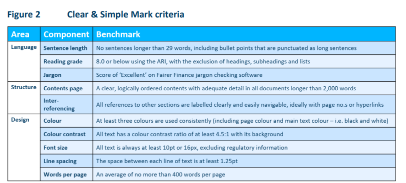
Fairer Finance Clear and Simple Criteria
External Benchmark: Fairer Finance Criteria The third-party assessment framework (jargon score & 29-word sentence cap) against which our rewrite was measured.